Pepsi MAX Unveils Refreshed Look: A Nostalgic Tribute with a Modern Twist
Celebrating Heritage While Embracing Innovation in the Journey Towards Pepsi Zero Sugar
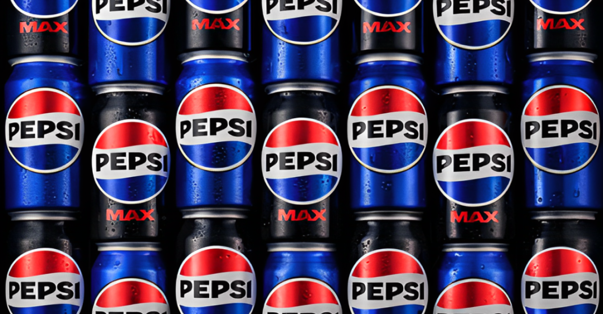
After 14 years, Pepsi MAX debuts its much-anticipated redesign, harking back to its iconic 1990s branding while embracing a modern twist.
The centerpiece of the revamp is the revamped logo, boasting a striking blend of ‘electric blue and black’ set against a timeless white background, reminiscent of Pepsi’s illustrious heritage spanning decades.
In a nod to the brand’s rich history, the soft drinks titan aims to strike a delicate balance between nostalgia and innovation. The rebrand not only pays homage to Pepsi’s illustrious past but also underscores its unwavering commitment to Pepsi Zero Sugar.
As Pepsi MAX boldly steps into the future, it remains firmly rooted in its legacy, ensuring a seamless transition that resonates with both loyal fans and a new generation of consumers.
Indeed, the redesigned packaging is a visual testament to Pepsi’s enduring legacy and its relentless pursuit of excellence in taste and quality.
Check out our socials
Lorem ipsum dolor sit amet, consectetur adipiscing elit Lorem ipsum dolor sit amet, consectetur adipiscing elit
The latest packaging projects

Make packaging your ambassador in new markets
Is your packaging design failing to communicate?
Agile and Flexible: How Smaller Brands Can Compete With And Beat The Big Boys
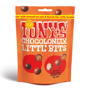
Packaging is an effective way for even the smallest of brands to challenge established players and, in many instances, outmanoeuvre corporate giants with innovative products.